미니멀 커피 패키지 라벨 (Minimalist Coffee Package Label)
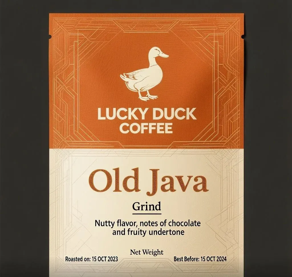
99mm×138mm 실제 인쇄 규격까지 지정한 지시문이 그대로 살아난 커피 파우치 라벨 — 로고·상품명·풍미 노트·로스팅 날짜·유통기한까지 문구 전체가 한 글자도 깨지지 않고 완성됐다
예시 이미지
프롬프트
Flat 2D graphic preview of a modern, minimalist coffee label design measuring 99mm wide x 138mm high. There must be a quiet area of 5mm around each edge. This means no straight lines, type or information within this area.

Top Section (40% Height): Burnt Orange — #C65D2E featuring a subtle micro-texture and fine geometric linework forming an intricate angular motif. Centered is a warm silver-cream (#F2F0E6) silhouette of a duck standing upright, positioned directly above stacked, clean sans-serif typography reading "LUCKY DUCK" on the top line and "COFFEE" directly underneath.
Bottom Section (60% Height): Warm silver-cream (#F2F0E6) background overlaid with delicate geometric linework creating an angular frame around the text.
Main Text: Centered product name "Old Java" in a prominent serif typeface with a textured inline pattern (Font height ~7mm–8mm). Directly below is "Grind" in a clean sans-serif font with a thin underline (Font height ~3.5mm–4mm), followed by "Nutty flavor, notes of chocolate and fruity undertone" across two lines (Font height ~3.5mm–4mm).
Footer Layout: Centered above the bottom margin is "Net Weight". Bottom-left corner displays "Roasted on: 15 OCT 2023", and bottom-right corner displays "Best Before: 15 OCT 2024" (Font height ~1.5mm–2mm).
Color Palette: High-contrast two-tone palette of Burnt Orange — #C65D2E and warm silver-cream (#F2F0E6).
Style: Professional graphic design vector asset, crisp line art, clean geometric structure, ultra-high resolution.

Top Section (40% Height): Burnt Orange — #C65D2E featuring a subtle micro-texture and fine geometric linework forming an intricate angular motif. Centered is a warm silver-cream (#F2F0E6) silhouette of a duck standing upright, positioned directly above stacked, clean sans-serif typography reading "LUCKY DUCK" on the top line and "COFFEE" directly underneath.
Bottom Section (60% Height): Warm silver-cream (#F2F0E6) background overlaid with delicate geometric linework creating an angular frame around the text.
Main Text: Centered product name "Old Java" in a prominent serif typeface with a textured inline pattern (Font height ~7mm–8mm). Directly below is "Grind" in a clean sans-serif font with a thin underline (Font height ~3.5mm–4mm), followed by "Nutty flavor, notes of chocolate and fruity undertone" across two lines (Font height ~3.5mm–4mm).
Footer Layout: Centered above the bottom margin is "Net Weight". Bottom-left corner displays "Roasted on: 15 OCT 2023", and bottom-right corner displays "Best Before: 15 OCT 2024" (Font height ~1.5mm–2mm).
Color Palette: High-contrast two-tone palette of Burnt Orange — #C65D2E and warm silver-cream (#F2F0E6).
Style: Professional graphic design vector asset, crisp line art, clean geometric structure, ultra-high resolution.
파라미터
| 파라미터 | 값 |
|---|---|
| seed | 494167 |
| dimensions | 1024x1024 |
재현 절차
- Hero(PromptHero 자체 라우터) 환경에 prompt 필드 원문을 그대로 입력한다 — 원문에는 Top Section부터 Style까지 이어지는 사양 문단 전체가 한 번 더 반복돼 있는데, 이 중복도 그대로 유지한다
- 직접 재현이 필요하면 Hero 대신 실제 호출된 하부 모델인 Hunyuan Image 3(tencent/hunyuan-image-3)를 써도 같은 계열의 결과를 얻을 수 있다 — 소스 메타데이터에 PromptHero의 스마트 라우터가 '텍스트 비중이 큰 패키지 디자인 요청이라 Hunyuan이 적합하다'는 이유로 이 모델을 선택했다고 남아 있다
- dimensions 1024×1024, seed 494167로 맞춘다
- 다른 브랜드로 확장하려면 `LUCKY DUCK` / `COFFEE` / `Old Java` 문구와 헥스코드 `#C65D2E`, `#F2F0E6`만 원하는 값으로 바꾸고, mm 단위 레이아웃·폰트 크기 지시는 그대로 유지한다
후보정
실제 다이라인(재단선)에 앉히려면 `5mm 여백` 지시가 결과물에 정확한 수치로 반영되지는 않았으므로, 라벨 테두리 장식선과 재단선 사이 여백을 다시 확인하고 필요하면 캔버스를 확장해야 한다.
PromptHero에는 모델명이 “Hero 1.0”으로만 표기돼 있지만, 소스 페이지의 생성 메타데이터를 직접 열어보면 이번 요청에서 실제로 호출된 하부 모델은 tencent/hunyuan-image-3였다. PromptHero의 “Hero”는 프롬프트 내용을 분석해 적합한 모델로 자동 라우팅하는 자체 시스템인데, 이 케이스의 라우팅 사유로 “정밀한 기술 사양과 텍스트 렌더링 요구, 기하학적 레이아웃을 가진 깔끔한 상업 제품 디자인 요청 — Hunyuan은 제품 패키지, 텍스트 비중이 큰 디자인, 구조화된 레이아웃에 강하다”는 문구가 메타데이터에 그대로 남아 있다. 즉 “Hero”라는 이름표는 PromptHero의 자체 브랜딩일 뿐, 재현 시에는 Hunyuan Image 3를 직접 호출해도 같은 계열의 결과를 얻을 수 있다는 뜻이다. seed는 494167, 최종 이미지는 1024×1024·133895바이트로 기록돼 있다.
프롬프트 자체는 실물 커피 파우치 라벨의 인쇄 사양서에 가깝다. Flat 2D graphic preview of a modern, minimalist coffee label design measuring 99mm wide x 138mm high가 실제 인쇄 규격(mm)까지 지정하고, There must be a quiet area of 5mm around each edge로 여백 규칙까지 못박는다. Top Section (40% Height)와 Bottom Section (60% Height)가 라벨을 정확히 두 구획으로 나누고 각 구획 배경색을 헥스코드(#C65D2E, #F2F0E6)로 직접 지정한 뒤, 로고 실루엣(오리)과 브랜드명(LUCKY DUCK / COFFEE), 상품명(Old Java), 풍미 노트, 중량 표기, 로스팅 날짜, 유통기한까지 각 텍스트 요소의 폰트 높이(mm 단위)까지 문단별로 못박아 지정한다.
이 프롬프트에서 가장 눈에 띄는 특징은 원문이 Top Section...부터 Style: Professional graphic design vector asset...까지 이어지는 사양 문단 전체를 한 번 더 그대로 반복한다는 점이다 — 원 작성자가 프롬프트를 실수로 두 번 붙여넣은 것으로 보이는 이 중복은 다행히 결과물에 이렇다 할 부작용을 남기지 않았다(같은 지시가 두 번 겹쳤을 뿐 서로 어긋나는 내용이 없어서로 보인다). verbatim 원칙에 따라 이 사이트의 prompt 필드에도 중복을 그대로 남겨 두었으니, 실제로 재현할 때는 굳이 두 번 반복해 입력할 필요 없이 한 번만 입력해도 무방하다. 재현 시 dimensions 1024×1024, seed 494167을 맞추면 되고, Hunyuan Image 3를 직접 쓸 수 있는 환경이라면 라우팅 단계 없이 곧바로 같은 계열의 결과를 얻을 수 있다.
이 엔트리의 핵심 가치는 로고·상품명·풍미 설명·중량·로스팅 날짜·유통기한이라는 실제 식품 라벨에 필요한 정보 항목이 전부 정확한 위치에 정확한 글자로 렌더링됐다는 점이다. 대부분의 이미지 생성 모델이 라벨 텍스트를 주문하면 절반은 뭉개진 글자로 돌려주는 것과 달리, 이 결과는 실제 원두 파우치 목업으로 바로 써도 될 만큼 모든 문구가 깨끗하게 살아 있다. 브랜드명·상품명·헥스코드만 바꾸면 다른 식품·음료 브랜드의 패키지 라벨 시안으로 그대로 확장할 수 있는 템플릿이라, 소규모 F&B 브랜드의 초기 패키지 목업이나 클라이언트 프레젠테이션용 시안으로 바로 쓸 만하다.
다만 no straight lines, type or information within this area처럼 여백 규칙을 지정한 것치고 결과물의 라벨 테두리에는 얇은 기하학적 프레임 장식선이 가장자리 가까이까지 이어져 있어, “5mm 여백”이라는 인쇄 규격 지시가 정확한 수치로 반영됐다기보다 “가장자리를 비워두라”는 대략적인 방향으로만 해석됐다고 보는 편이 안전하다. 실제 인쇄용 다이라인에 앉힐 때는 여백을 직접 다시 확인해야 한다.
출처
- PromptHero — Flat 2D graphic preview of a modern, minimalist coffee label design… · 수집일 2026-08-31 · 원문 전체 확인
- 이미지: 출처 페이지의 실제 생성 결과물 (원본 1024×1024) — 출처 사이트 워터마크 제거를 위해 하단 50px 크롭